Along
with the rest of the world, we tend to be obsessed with productivity. We want
to produce more in less time. We want to do so without negatively affecting the
quality of our products or services.
The digital age has proved to be both a
blessing and a curse in this respect. New technologies have provided us with
high-quality productivity-boosting tools. At the same time, it has placed
greater demands on us to become more productive.
The rat race is still with us, and it’s
faster than ever.
We’ve discovered areas where technology is
indeed a friend. One of those areas comes in the form of smartphone apps and
other productivity apps. These wonderful creations help us manage our projects
and our personal schedules. They help us organize errands, and even plan our
meals.
We’re pleased to present for your
consideration the top productivity apps for 2019.
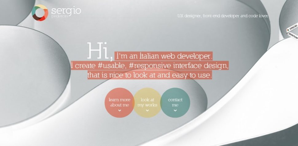
1.
Mason
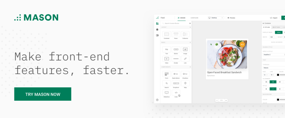
Mason
provides increased productivity with a capital P. This front-end
feature-building platform for product design teams allows them to quickly,
economically, and efficiently create high-quality front-end features for their
apps.
Mason’s feature-building process is a model
of efficiency and high productivity, but where this tool really shines is where
it enables teams to skip wireframing and prototyping, documentation, QA
inspection and coding as they proceed through design and product deployment.
Teams can also make changes to their
front-end creations quickly; even after a product has already been deployed and
is in maintenance mode. In fact, any authorized product stakeholder who has a
Mason account can add features and make changes to a product that’s up and
running.
Mason’s building blocks and visual
interface are key to designing and building software features for websites,
apps, and other digital products. If you’ve been looking for a UI/UX tool that
can create a software feature faster, with great precision, and save you time
and money, give this productivity app a close look.
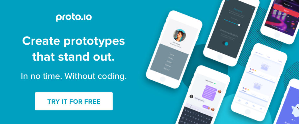
2. Proto.io
Proto.io
is an easy-to-use web application which designers, developers, product
managers, and entrepreneurs can use for prototyping when designing mobile and
web apps. Nor coding skills are required neither are any special design skills
required to build either low-fidelity or high-fidelity prototypes.
Proto.io consists of three environments:
the Dashboard, the Editor and the Player. Proto.io’s Dashboard provides
invaluable version control assistance which is especially important during
rapid prototyping activities. The Editor takes care of the entire process of
prototype-building, and the Player displays in your browser what you’ve
accomplished and in addition, it plays a major role in user testing.
Proto.io 6, the latest version of this
productivity tool, features a redesigned user interface, new state transitions,
easy sharing options, a new Proto.io app for Android and iOS integration with
user testing platforms, and more.
3. monday.com
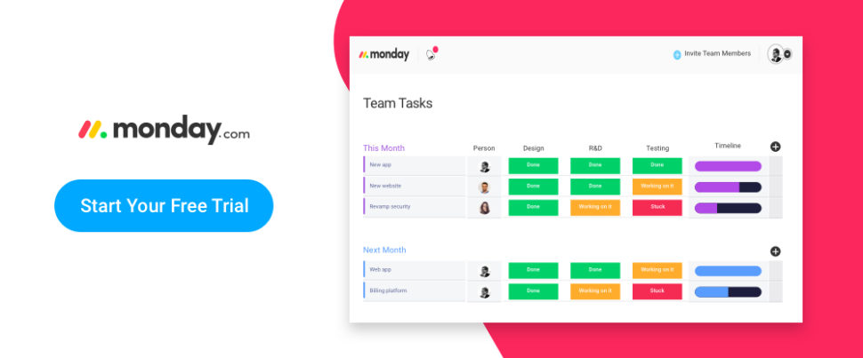
monday.com
is a centralized team management tool that helps teams manage every aspect and
detail of their day-to-day tasks, and plan, organize, and track their work in a
single visual and collaborative space.
Once you’ve decided upon what’s important and
helpful for your team, monday.com will capture and visualize the requisite
information so you can see who’s in charge of what, track time, and generally
speed up workflow and throughput.
Project leaders and team members alike love
this productivity-boosting team management tool because of the culture of
transparency it promotes and supports. When all parties concerned can view the
same information, it gives them a greater sense of importance and empowerment.
monday.com is currently managing the work of
more than 50,000 teams in 76 countries. It’s an intuitive, beautifully
organized team management tool that helps connect people to processes.
4. ActiveCollab
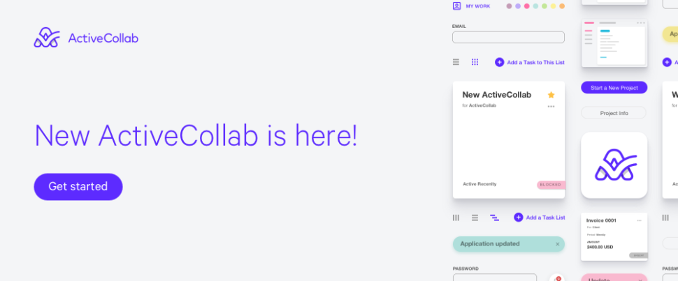
The
latest version of this popular project management software features a host of
new and enhanced features and is better in almost every way you can think of.
Of particular note is the task dependencies with automatic rescheduling
feature.
In new Active Collab, when a change is made to a
parent task, each child task is automatically updated and rescheduled –
removing excessive busywork.
5.
Nutcache
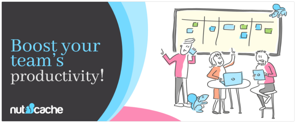
Nutcache
provides an all-in-one project management software solution that helps project
managers and teams manage tasks smarter and with greater efficiency. It
promotes team collaboration from a project’s initial planning and estimating
tasks through final billing.
Nutcache also performs time tracking duties
and automates expense management and invoicing. This app’s flexibility and
simplicity has made it a popular and useful tool to help teams organize and
deliver work on time and within budget.
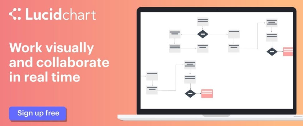
Lucidchart
belongs in your project management toolkit if your team is spread across
different locations and team members are working on a mix of different
operating systems.
Lucidchart also saves time and eliminates
misunderstandings and misconceptions because of its ability to help you
visually communicate complex ideas or make technically-oriented presentations
to non-technical audiences. It does this by providing a library of useful
shapes to create virtually any type of a presentation diagram.
Top 5 Productivity Tips to Achieve More and Create Peace of Mind
Tip #1. Write it down.
Make a habit of
writing down every task to be done and every commitment you’ve made. Trying to
remember something you committed to last week? Or, maybe, something you should
have added to your to-do list? This can often prove to be distracting and
energy-sucking.
Tip #2. Do the task you dread doing first.
Since you’re going
to have to do it eventually, do it now. You’ll feel good about yourself once
you’ve done it.
Tip #3. Take breaks – religiously.
You can devote your
full attention to a task for only so long before the law of diminishing returns
kicks in. Experiment with the Pomodoro (Tomato) principle. Take a 5-10 minute
break every 40 minutes – whatever works best for you. Doing so will help you mentally
and physically.
Tip #4. Exercise
We’re not talking
about extreme sports training. Walk, jog, stretch, or practice some
muscle-strengthening exercises. Do this daily or several times a week. Healthy
people are more productive.
Tip #4. Learn to say no.
Say yes to
everything and everyone and you end up letting everyone else control your life.
Pick and choose tasks and commitments judiciously and you’ll be far more
productive.
Conclusion
Take the above
productivity tips seriously and make a habit of following them. You should
start noticing some very positive results in a short time. If you can use one
of more of the productivity tools listed above so much the better.
You’ll have more
control over your work, you’ll be more productive, and you’ll feel much better
about yourself.
Read More at Top 6 productivity apps for design teams – pick your perfect match!
from Web Design Ledger https://webdesignledger.com/top-6-productivity-apps-for-design-teams-pick-your-perfect-match/


 @shalaneflanagan. #justdoit
 on.
on.
